NIPC — Neon Ink Palette Contract
Status: Canonical palette contract for Neon Ink v0.1.1 Host System: Aptlantis Studio Compatible With: Neon Ink v0.1.x, AIC v0.1.x, SESM v0.3.x, APGC v0.1.x Scope: Semantic color families, token roles, psychological intent, intensity rules, and palette validation for generated artifacts, website UI, and brand surfaces.
:::info Document Lineage
This page is built from Docs/NIPC-v0.1.1.md, the canonical version. Docs/NIPC-PaletteContract.md is an earlier pre-cursor draft of the same material without the canonical header or the APGC geometry-restraint section (§12 below) — it is superseded by this document and kept only as historical evidence in the source tree.
:::
Canonical Relationship
NIPC is the palette authority for the Aptlantis Studio spec set.
| Layer | Canonical Document | Responsibility |
|---|---|---|
| Meaning | SESM standard | Embedded metadata, identity, provenance, links, agent hints |
| Palette | This document (NIPC) | Color families, semantic roles, psychological intent, intensity, validation |
| Contract | AIC | Artifact types, required fields, layout regions, render targets |
| Expression | Neon Ink | Brand system, typography, panel grammar, page composition, voice |
Core rule:
Color should reduce cognitive load before it adds beauty.
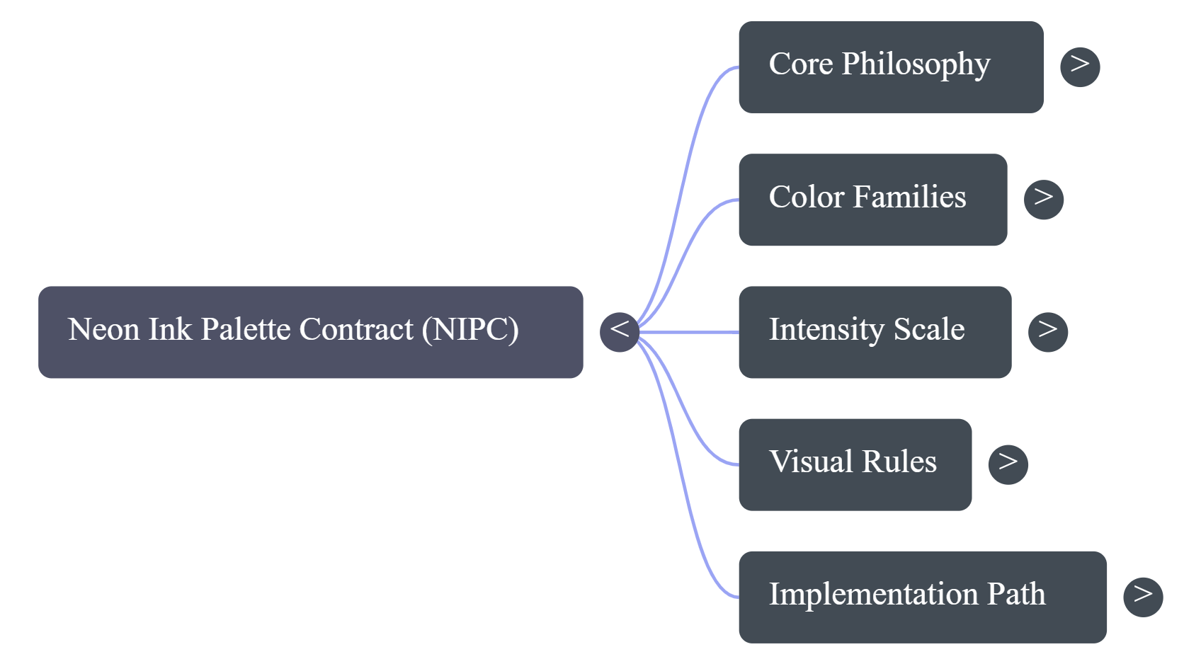
:::note Missing Source Images
The source document also references assets/dalle/ColorMeansSomething.png and assets/dalle/StateVsSemanticRole.png as illustrative conceptual images. Neither file exists in the source assets/ tree (there is no assets/dalle/ folder), so those two images are omitted here rather than linked as broken references.
:::
1. Current System Strengths
The existing palette is already clean and functional:
| Current Color | Current Role | Psychological Direction |
|---|---|---|
| Cyan / Blue | Info, structure, general explanation | Calm, clarity, system trust |
| Violet | Process, how-it-works | Abstract thinking, systems, transformation |
| Yellow | Important, caveat, attention | Alertness, emphasis, memory anchor |
| Red | Critical, risk, constraint | Stop, danger, error, urgency |
| Green | Validated, good, supported | Trust, safety, completion |
| Orange | Code, Rust, build | Energy, construction, action |
| Magenta | Featured, creative | Novelty, specialness, personality |
| Indigo | Experimental | Research, exploration, uncertainty |
| White | Definition, canonical | Neutrality, clarity, anchor text |
The documents also already separate hue from state strength: color is semantic role, while brightness/glow/animation is state/activity intensity. That is a huge design decision because it prevents the system from turning into random neon chaos.
2. Recommended Expansion Model
Rather than simply adding "more colors," the system expands into color families.
Color Family → Psychological Function → Semantic Roles → Token Variants
Example:
Cyan Family → clarity / structure / orientation
  - info
  - structure
  - navigation
  - reference
This means the user subconsciously learns:
"Cyan-ish things help me orient."
"Green-ish things tell me trust/completion."
"Yellow/amber things deserve attention."
"Purple/indigo things are process/research/abstraction."
"Magenta/pink things are discovery/creative/featured."
That is much more powerful than a flat list of 20 colors.
3. Expanded Neon Palette
A. Clarity / Orientation Family
Use these when the user needs to understand where they are, what something is, or how to read it.
| Token | Hex | Role | Best Use |
|---|---|---|---|
info | #22D3EE | General info | Existing cyan default |
structure | #06B6D4 | System structure | Layout, architecture, schemas |
navigation | #38BDF8 | Where to go next | Nav cards, related links |
reference | #7DD3FC | Docs/reference | Canonical docs, definitions with links |
orientation | #67E8F9 | Page guidance | Intro panels, "start here" blocks |
Psychology: blue/cyan feels calm, competent, and technical. It lowers perceived risk and helps dense interfaces feel navigable.
Use heavily, but softly. This should probably be the dominant family across Aptlantis Studio.
B. Trust / Validation Family
Use these when the user needs to know this is usable, verified, safe, complete, or recommended.
| Token | Hex | Role | Best Use |
|---|---|---|---|
success | #34D399 | Validated / good | Existing green |
verified | #22C55E | Confirmed | Dataset verification, checks passed |
stable | #86EFAC | Mature / safe | Stable pipelines, production-ready |
reproducible | #2DD4BF | Reproducibility | Hashes, manifests, deterministic builds |
available | #A7F3D0 | Present / downloadable | Download cards, mirror availability |
Psychology: green signals safety, completion, permission, and "you can proceed."
Important distinction: Use green for trust, not just "positive vibes." If everything good is green, it loses meaning. Reserve it for evidence-backed status.
C. Attention / Learning Anchor Family
Use these when the user should pause, notice, remember, or read carefully.
| Token | Hex | Role | Best Use |
|---|---|---|---|
important | #FACC15 | Important | Existing yellow |
note | #FDE047 | Helpful note | Non-danger callouts |
caution | #FBBF24 | Soft warning | Caveats, incomplete fields |
decision | #F59E0B | Choice point | "Pick this path" panels |
memory-anchor | #FEF08A | Key takeaway | About page highlights |
Psychology: yellow increases attention and recall, but too much yellow causes fatigue.
Rule: yellow should be a marker, not a background. Use it as a left rail, badge, small glow, underline, or icon accent.
D. Risk / Constraint Family
Use these for actual blockers, failures, risk, legal issues, missing data, or broken assumptions.
| Token | Hex | Role | Best Use |
|---|---|---|---|
critical | #F43F5E | Critical / risk | Existing red |
error | #EF4444 | Failure | Build failure, validation failure |
blocked | #FB7185 | Blocked state | Missing required input |
constraint | #E11D48 | Hard limitation | Licensing, compatibility, provenance limits |
deprecated | #BE123C | Do not rely on this | Old artifacts, superseded pipeline |
Psychology: red is the strongest visual interrupt. It raises urgency immediately.
Rule: do not use red for ordinary emphasis. Red must mean: something needs attention before proceeding.
E. Process / Transformation Family
Use these for pipelines, flow, transformation, how-it-works, and internal mechanics.
| Token | Hex | Role | Best Use |
|---|---|---|---|
process | #A78BFA | Process / how | Existing violet |
pipeline | #C084FC | Pipeline flow | Timeline stages |
transform | #D8B4FE | Conversion/normalization | Data shaping steps |
automation | #8B5CF6 | Automated system | Generator behavior |
orchestration | #DDD6FE | Multi-step system | Cross-artifact flows |
Psychology: violet/purple feels abstract, conceptual, and slightly futuristic. It is perfect for "this is how the system thinks."
Rule: violet should mean "process is happening" or "this explains the machinery."
F. Creation / Build / Code Family
Use these when the content is hands-on, code-heavy, build-related, or operational.
| Token | Hex | Role | Best Use |
|---|---|---|---|
code-heat | #F97316 | Code / Rust / build | Existing orange |
build | #FB923C | Build steps | Generator output, compilation |
operation | #FDBA74 | CLI / execution | Commands, scripts, task panels |
artifact-output | #EA580C | Generated artifact | SVG/HTML output cards |
tooling | #FFEDD5 | Tools/utilities | Utility panels, app references |
Psychology: orange is energetic and action-oriented. It says "work is being done."
Rule: orange should be used for doing, not explaining. Violet explains the pipeline; orange executes the pipeline.
G. Discovery / Creative / Featured Family
Use these for featured material, creative datasets, special panels, story sections, or human-facing delight.
| Token | Hex | Role | Best Use |
|---|---|---|---|
featured | #F472B6 | Featured / highlight | Existing magenta |
creative | #EC4899 | Creative content | Brand/story panels |
discovery | #E879F9 | New or interesting | "Explore this" panels |
spotlight | #F0ABFC | Showcase | Homepage highlights |
human-note | #FDA4AF | Personal/context note | About page warmer passages |
Psychology: magenta/pink feels novel, expressive, and emotional. It adds humanity to a highly structured system.
Rule: use magenta sparingly but consistently. It should feel like "this is special," not "this is random decoration."
H. Research / Experimental Family
Use these for prototype, unknown, early, research, speculative, or not-yet-stable.
| Token | Hex | Role | Best Use |
|---|---|---|---|
experimental | #818CF8 | Experimental | Existing indigo |
research | #6366F1 | Research content | New ideas, studies |
prototype | #A5B4FC | Prototype | Work-in-progress artifacts |
hypothesis | #C4B5FD | Hypothesis | Speculative notes |
unstable | #4F46E5 | Early unstable | Experimental builds |
Psychology: indigo sits between trust-blue and abstraction-purple. It feels thoughtful, exploratory, and technical.
Rule: indigo should not mean "bad." It should mean not fully settled yet.
I. Canonical / Archive / Neutral Family
Use these for definitions, archival state, base facts, historical records, or quiet metadata.
| Token | Hex | Role | Best Use |
|---|---|---|---|
canonical | #E5E7EB | Canonical definition | Existing white |
archive | #94A3B8 | Archived | Old snapshots |
muted | #64748B | Low priority | Metadata labels |
unknown | #CBD5E1 | Unknown state | Missing non-critical info |
baseline | #F8FAFC | Primary readable text | Definition blocks |
Psychology: white/slate creates rest, hierarchy, and relief. In a neon interface, neutral colors are what keep the whole thing pleasant.
Rule: neutral is not boring. Neutral is the oxygen around the neon.
4. Recommended Master Token Map
{
  "neon_ink_semantic_colors": {
    "info": "#22D3EE",
    "structure": "#06B6D4",
    "navigation": "#38BDF8",
    "reference": "#7DD3FC",
    "orientation": "#67E8F9",

    "success": "#34D399",
    "verified": "#22C55E",
    "stable": "#86EFAC",
    "reproducible": "#2DD4BF",
    "available": "#A7F3D0",

    "important": "#FACC15",
    "note": "#FDE047",
    "caution": "#FBBF24",
    "decision": "#F59E0B",
    "memory_anchor": "#FEF08A",

    "critical": "#F43F5E",
    "error": "#EF4444",
    "blocked": "#FB7185",
    "constraint": "#E11D48",
    "deprecated": "#BE123C",

    "process": "#A78BFA",
    "pipeline": "#C084FC",
    "transform": "#D8B4FE",
    "automation": "#8B5CF6",
    "orchestration": "#DDD6FE",

    "code_heat": "#F97316",
    "build": "#FB923C",
    "operation": "#FDBA74",
    "artifact_output": "#EA580C",
    "tooling": "#FFEDD5",

    "featured": "#F472B6",
    "creative": "#EC4899",
    "discovery": "#E879F9",
    "spotlight": "#F0ABFC",
    "human_note": "#FDA4AF",

    "experimental": "#818CF8",
    "research": "#6366F1",
    "prototype": "#A5B4FC",
    "hypothesis": "#C4B5FD",
    "unstable": "#4F46E5",

    "canonical": "#E5E7EB",
    "archive": "#94A3B8",
    "muted": "#64748B",
    "unknown": "#CBD5E1",
    "baseline": "#F8FAFC"
  }
}
That looks like a lot, but the system is not chaotic because it is grouped into families.
5. How To Use Color Psychology Without Making It Ugly
The big danger with neon colors is that they can become visually loud. The solution is to separate:
semantic color
surface intensity
glow intensity
component role
Recommended Intensity Scale
| Intensity | Name | Use |
|---|---|---|
0 | muted | archived, unknown, background metadata |
1 | whisper | tiny dot, thin rail, subtle label |
2 | soft | normal tags, semantic indicator |
3 | active | selected item, highlighted card |
4 | urgent | warning, running, featured |
5 | interrupt | error, critical blocker only |
The AIC document already has this general idea: state mapping controls glow, animation, and intensity separately from hue. Keep that. It is the difference between "neon language" and "neon noise."
6. Recommended Use on Q&A Pages
| Question Type | Color Role | User Effect |
|---|---|---|
| What is this? | info / canonical | Calm understanding |
| Why does this matter? | important / memory_anchor | Retention |
| How does it work? | process / pipeline | Step-by-step thinking |
| What can I do with it? | operation / build | Action readiness |
| Is it trustworthy? | verified / reproducible | Confidence |
| What are the limits? | constraint / caution | Careful evaluation |
| What is experimental? | experimental / prototype | Proper expectation |
| What should I explore next? | discovery / navigation | Curiosity and movement |
This makes the About page feel less like a wall of answers and more like a cognitive map.
7. AIC Extension
AIC does not just accept semantic_role; it defines a richer semantic styling object.
{
  "theme": {
    "id": "neon-ink",
    "semantic_role": "pipeline",
    "semantic_family": "process",
    "psychological_intent": "explain-system-flow",
    "state": "active",
    "intensity": 2,
    "glow": "soft",
    "priority": "medium"
  }
}
semantic_role tells the generator what color to use. semantic_family lets the UI group/filter things. psychological_intent tells future agents and validators why the color was chosen. state, intensity, and glow keep the rendering deterministic. See AIC for the full contract.
8. Visual Rules
Rule 1 — One dominant accent per artifact. Secondary colors can appear only as tiny badges, icons, micro-rules, or metadata dots.
Rule 2 — Red is sacred. Red should only mean error, critical, blocked, constraint, or deprecated. Do not use red just because it looks good.
Rule 3 — Yellow is a memory marker. Yellow should mark important, caution, decision, or key takeaway. Avoid yellow backgrounds; use yellow as a small, sharp marker.
Rule 4 — Green requires evidence. Green should mean verified, available, stable, reproducible, or complete. If something is merely positive but not verified, use cyan or magenta instead.
Rule 5 — Magenta is the delight layer. Magenta should be rare enough that it feels special: featured, creative, spotlight, human note, discovery.
Rule 6 — Neutral colors preserve elegance. For every bright semantic color, pair a nearby neutral: dark panel, muted border, soft label, low-glow background, readable white/slate text.
9. Artifact-Specific Recommendations
qa-item
Use a small semantic rail or dot, not a full-color panel.
{
  "artifact_type": "qa-item",
  "theme": {
    "semantic_role": "memory_anchor",
    "semantic_family": "attention",
    "state": "active",
    "intensity": 2
  }
}
dataset-card
Use color to answer: what kind of dataset is this?
| Dataset Type | Semantic Role |
|---|---|
| Rust/code corpus | code_heat |
| Validated model data | verified |
| Experimental small-model data | experimental |
| Canonical schema dataset | canonical |
| New featured release | featured |
pipeline-panel
Use violet for process, then overlay status color as a small state marker. A pipeline can be conceptually "process" while operationally "error" — AIC already separates semantic role from state.
theme-board
Add a psychology row: Color → Role → Psychological Intent → Best Artifact Types.
10. Practical Implementation Path
- Do not replace the current palette. Keep the existing core tags (cyan, violet, yellow, red, green, orange, magenta, indigo, white) as the stable base.
- Add aliases first under families without immediately using all of them everywhere.
- Update SESM/AIC fields with
semantic_family,psychological_intent, andintensity. - Build a theme-board SVG showing core palette, expanded palette, state intensity examples, artifact examples, and psychological intent.
- Validate usage — add generator validation warnings for red used with a non-risk role, green used without a validation/trust field, yellow used at intensity > 3 too often, more than two semantic families in one compact artifact, or a missing semantic indicator on a
qa-item.
11. The Core Principle
Color should reduce cognitive load before it adds beauty.
Cyan = understand
Green = trust
Yellow = notice
Red = stop
Violet = process
Orange = build
Magenta = discover
Indigo = experiment
White/slate = canonical/archive
That is the sweet spot: visually rich, emotionally pleasant, and cognitively useful.
12. Geometry Restraint Note (APGC Alignment)
Color and geometry must cooperate. When rendering error or critical semantic panels (red family, Risk intent), the combination of high-chroma red with aggressive angular geometry creates visual overload.
Rule: error and critical panels should not combine red accent with angle_energy above 2 (APGC scale).
Recommended pairings:
| Semantic Role | NIPC Family | Max Angle Energy |
|---|---|---|
error | Risk / Red | 2 |
critical | Risk / Red | 1 |
warning | Attention / Yellow | 3 |
verified | Trust / Green | 2 |
active | Clarity / Cyan | 3 |
featured | Discovery / Magenta | 4 |
experimental | Research / Indigo | 3 |
Generators should validate this pairing. See APGC §17.2 for the full geometry restraint rules.